Brand Design / UX Design / Copy
Challenge: Substance abuse continues to rise around the world. Many users have little to no support system outside of the hospital, and struggle to avoid relapse in their daily lives.
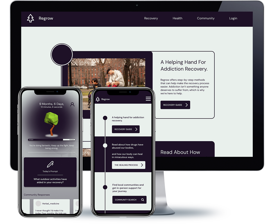
Solution: Regrow, a recovery companion app designed to assist in combatting the daily struggles of addiction.
The Run-Down
Regrow functions as a “helping hand”. Conceived in response to the heightened awareness of social media and gaming addiction, this app concept steps forward as a supportive tool for managing non-life-threatening dependencies.
Regrow is based around the principalities of community support, habit cultivation, and long-term goal setting. From daily journalling to a supportive user network sharing common aspirations, Regrow is crafted to plant a new mindset into our users, and give them the tools they need to flourish.
Research Summary
First and foremost, our users are not addicts. They are people. Addiction is not their defining factor.
Research was conducted under the guise that users go out with friends, work jobs, and live an ordinary life, all while struggling with peer pressure and the stressors of addiction and withdrawal. SmartRecovery’s DEADs system and counseling groups such as AA served as inspiration for audience that will be using Regrow.
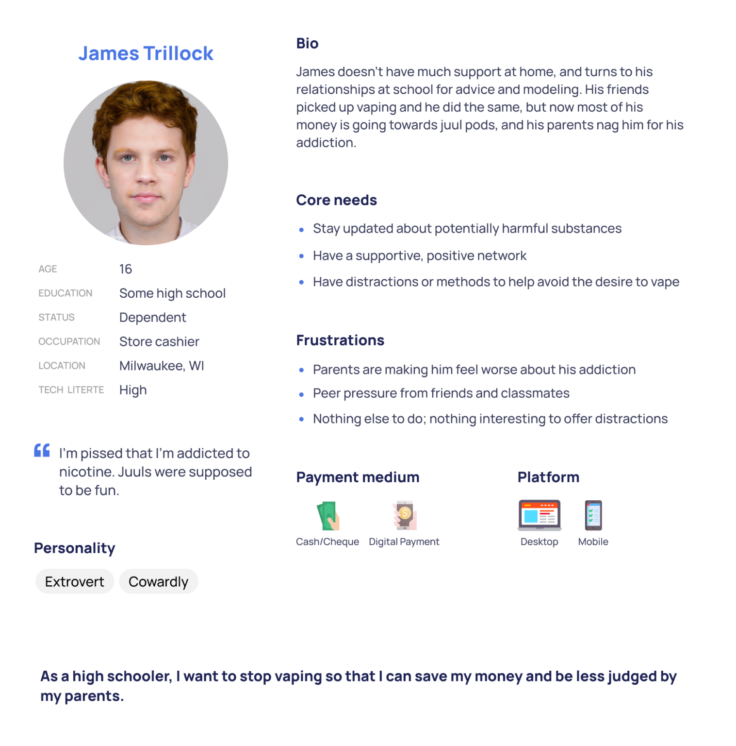
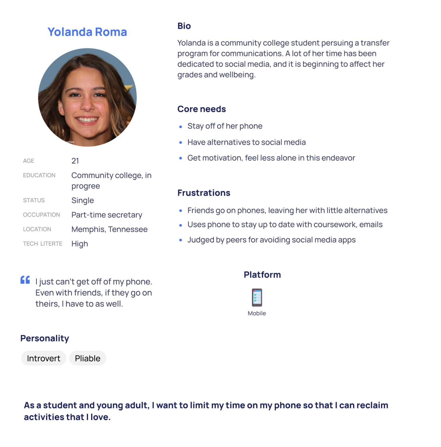
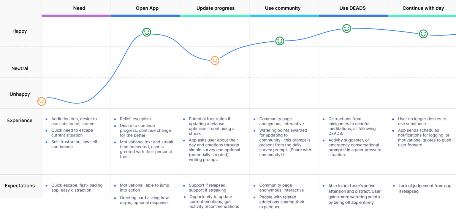
I used this knowledge to build out a journey map for when and why potential users will access Regrow, alongside personas to better understand the user’s needs.
A few key insights…
Regrow must serve primarily as a positive community/support system.
Features need to be able to be accessed instantly to that the user may escape their stressor.
Under no circumstance should the user feel bad for sharing their honest feelings or relapse info.
Addiction recovery has been mainly limited to in-person help, with few options in the virtual market.
Ideation
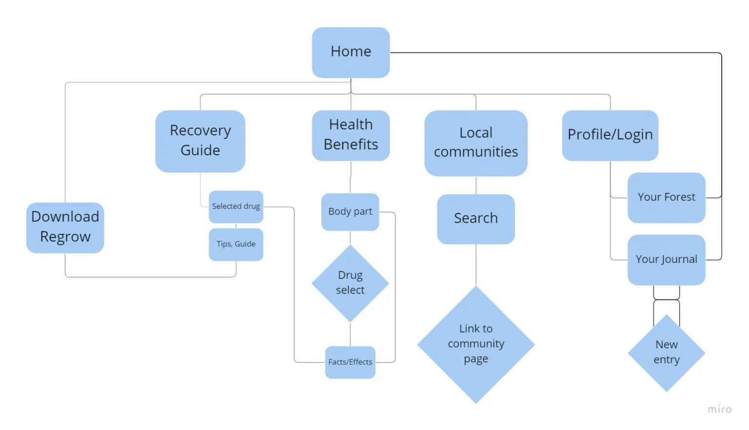
I chose to design the mobile app first, focusing on quickly accessible options from community support to meditation. Afterwards, I designed a web version that keeps users educated about the health benefits and steps of recovery.
Regrow’s dedicated mobile app was focused around immediate support.
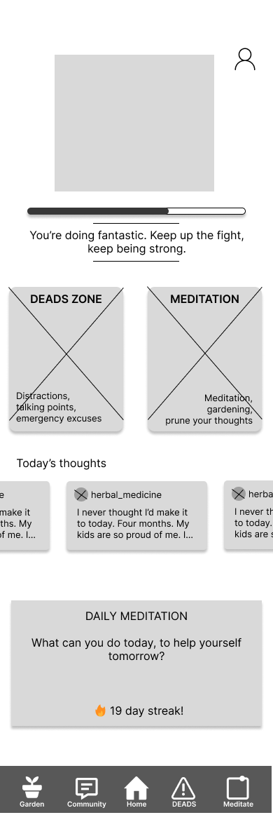
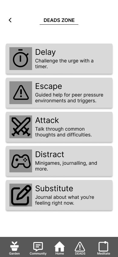
Based on the journey maps, it was clear that users would be turning to Regrow as a healthy form of escapism. This created the “DEADs ZONE” for the wireframe, a section dedicated to this quick access.
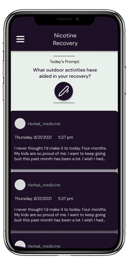
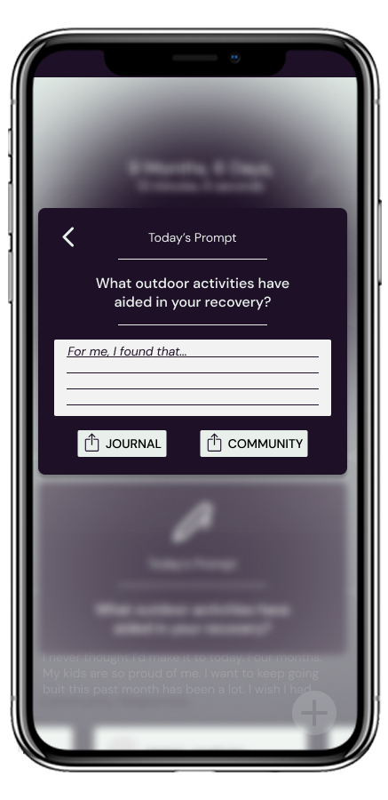
The users also needed quick, positive support. This came in the form of “Today’s thoughts”, a preview of what people in the community are saying.
A “Garden” page was implemented so that users could track trees that they’d previously grown and choose which type of tree they’d like to plant next.
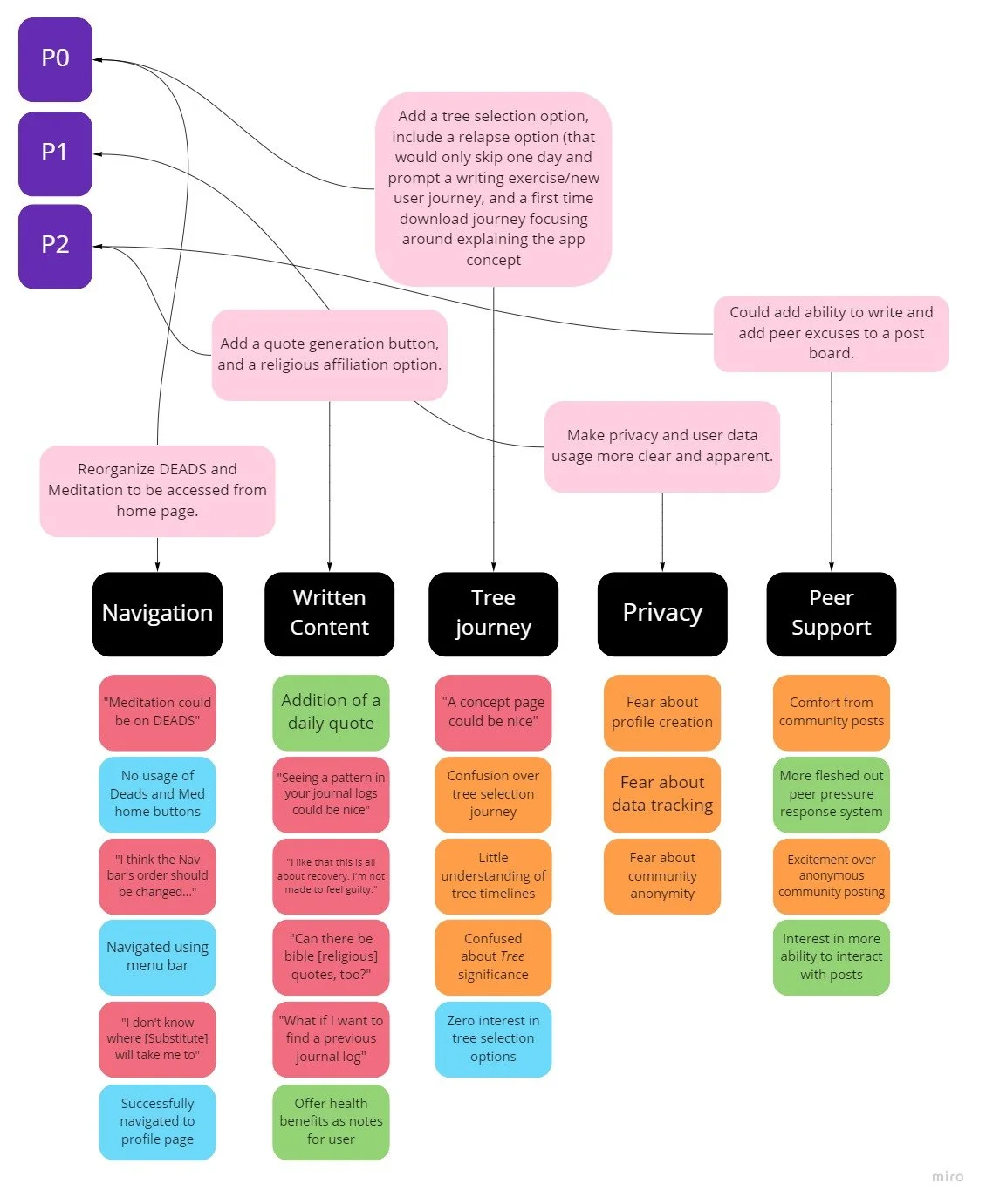
At this phase, it was unclear if the home page was being fully utilized, and if the DEADS and Meditation pages required separate pages on the navigation bar.
Usability testing began with these issues in mind, considering how users interacted with these elements specifically.
User Testing
Finding ideal participants for this product was more difficult, but I posted on Reddit and gained a sample of 8 people for an unmoderated usability test. This created a bias, because Reddit users were more likely to be more comfortable with technology trends. I counteracted this by surveying 2 seniors.
Users found that…
The buttons to access DEADs and Meditation were confusing.
The order of buttons on the navigation bar did not make sense.
The positive feedback was extremely beneficial.
The tree planting mechanic was confusing (“Are these being planted in real life?”)
There were privacy concerns regarding profile management and posting to the community page.
Most of the issues made mention of the home page, so that was the priority in the redesign. On top of that, a special walkthrough at the user’s first launch could provide them with more insight in the tree-planting feature, better explaining it as a way to show more personal “growth”.
Accessibility Consideration
Some users may be living in more rural areas that do not get good service, or may have to pay for every kilobyte of data. With this in mind, the app will ask for permission parameters on its first launch to establish which aspects of the app will receive data. When limited, the app’s community function will be disabled unless given permission to load.
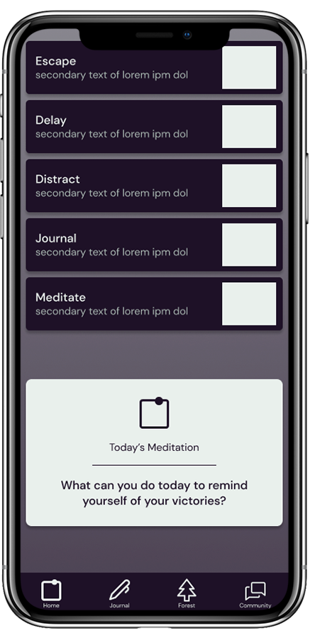
The redesigns saw an overhaul of the home page and the “Journal” page. The “DEADS” were replaced by simple buttons with labels like “Escape” and “Delay”, but now “Meditate” and “Journal” were added alongside them.
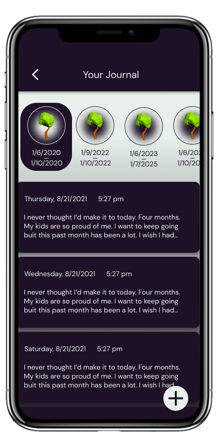
The “Journal” page’s note are now sorted by each user’s tree cycle, including the general timeline. Since the user associates the tree during each launch, this will make it easier to locate specific journal entries.
The web version of the app is simple, but straight to the point. With abilities to search for local support networks and educative facts about the recovery process, it offers information for users that are specifically looking to take that one extra step.
This project was a great test of my own testing skills. The usability studies were extremely beneficial, but I wasn’t able to see the results until I actively began sorting through them to find tangible results. On top of this, using existing materials like AA became vital in my understanding of how to assist the recovery process. I also made sure I kept the limitations of an app like this in mind, making sure it answered its user’s problems without causing any new ones.