Challenge: The U.W. Eau Claire’s Honors web presence required an updated layout and copy to better present content to potential Honors students.
Solution: A reorganized information structure based off of a silo design, using iconography to replace text, and a new tone to better reach Honors students and their parents.
Research Summary
Who is the Honors website serving? / Who would we like it to serve?
At the U.W. Eau Claire, most Honors students used the app Canvas to stay updated about everything Honors. The program is ever-changing, and Canvas serves the professors better. With this in mind, it was clear that the Honors site should target potential Honors students and parents as a sort of information hub.
I asked current Honors students to participate in a usability study to judge what was and wasn’t working about the original Honors page. Here’s what I found:
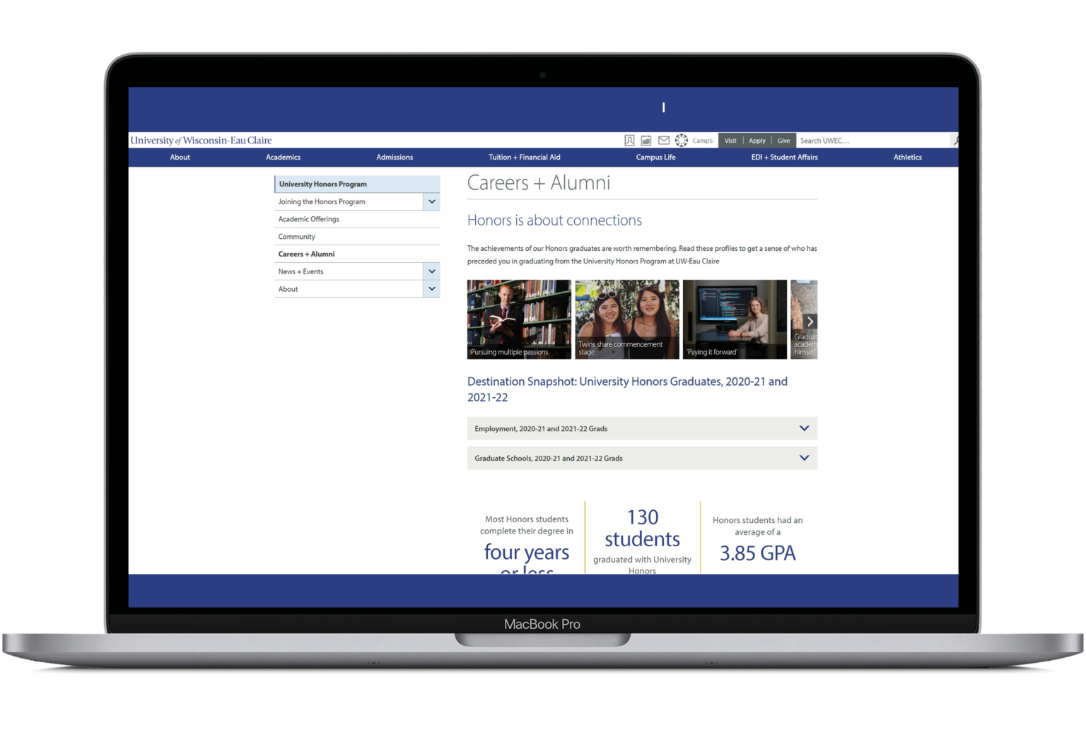
Users struggled to navigate out of the landing page.
Information about scholarships and benefits needs to more accessible.
“I use the search bar for everything.”
Users could not navigate to over half of the pages when asked.
Information Labyrinth
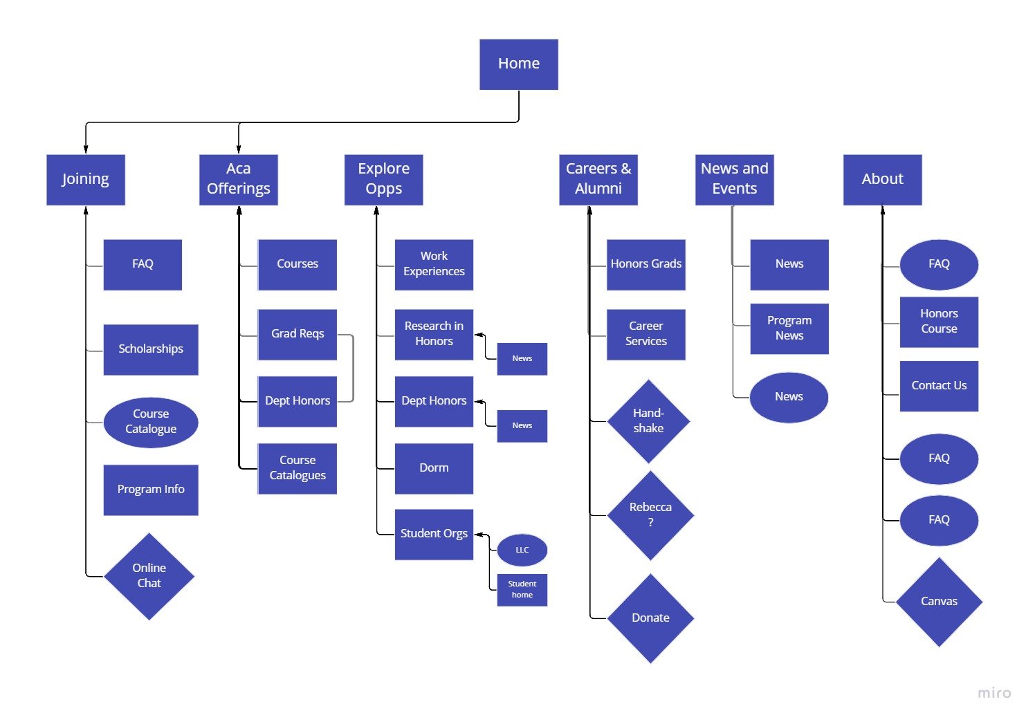
Navigating the Honors site was the biggest issue. Every item of content had its own page, which led to higher bounce rates. The redesign kept all of that content, but that content was now collected onto one page.
I also implemented a “Community” page based off of persona research. Potential students and parents are looking for a sense of community and belonging in college. This Honors program offers this, so it made sense to better represent this aspect of Honors.
Ideation
I based my updated designs off of a reworked information architecture. The goal was to reduce the number of pages and through-clicks in the process, all while containing an equal amount of important information.
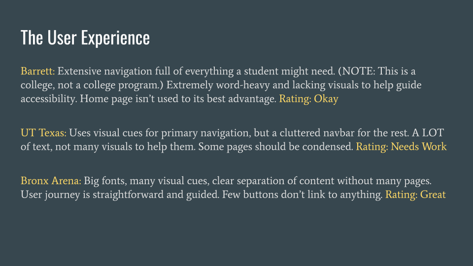
I also ran competitive audits on related businesses and honors programs to get an understanding of a standard structure, what works, and what doesn't.
Prototyping
Final Results
The updated Honors landing page serves as a launch-point for everything a user may be trying to reach. The user no longer needs to rely on the navigation bar on the side.
Icons and short text descriptions serve as a smarter navigation system.
The course catalogue was a key point for many users, so it earned its own spot on the landing page.
The many subpages were converted to singular hubs, with the more extensive content moved to accordions.
There were also dozens of news articles that had received nearly no views because there was no feasible access point. Now, related articles can be found on select pages.
What I Learned
The stakeholder feedback was greatly appreciated in this project. I was given strong direction towards the new written tone, while I was given more freedom to restructure the content. I was encouraged to go beyond my original redesigns, which was necessary and I ended up creating a much more fluent, creative design.


